- <h:selectBooleanCheckbox>
在视图上呈现一个核取方块,例如:
我同意 <h:selectBooleanCheckbox value="#{user.aggree}"/>
value所绑定的属性必须接受与传回boolean类型。这个组件在网页上呈现的外观如下:

- <h:selectOneRadio>、<h:selectOneListbox>、<h: selectOneMenu>
这三个标签的作用,是让使用者从其所提供的选项中选择一个项目,所不同的就是其外观上的差别,例如:
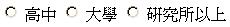
<h:selectOneRadio value="#{user.education}">
<f:selectItem itemLabel="高中" itemValue="高中"/>
<f:selectItem itemLabel="大学" itemValue="大学"/>
<f:selectItem itemLabel="研究所以上" itemValue="研究所以上"/>
</h:selectOneRadio><p>
<f:selectItem itemLabel="高中" itemValue="高中"/>
<f:selectItem itemLabel="大学" itemValue="大学"/>
<f:selectItem itemLabel="研究所以上" itemValue="研究所以上"/>
</h:selectOneRadio><p>
value所绑定的属性可以接受字符串以外的类型或是自订类型,但记得如果是必须转换的类型或自订类型,必须搭配 标准转换器 或 自订转换器 来转换为对象,<h:selectOneRadio>的外观如下:
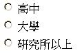
您也可以设定layout属性,可设定的属性是lineDirection、pageDirection,默认是lineDirection,也就是由左到右来排列选项,如果设定为pageDirection,则是由上至下排列选项,例如设定为:
<h:selectOneRadio layout="pageDirection"
value="#{user.education}">
<f:selectItem itemLabel="高中" itemValue="高中"/>
<f:selectItem itemLabel="大学" itemValue="大学"/>
<f:selectItem itemLabel="研究所以上" itemValue="研究所以上"/>
</h:selectOneRadio><p>
value="#{user.education}">
<f:selectItem itemLabel="高中" itemValue="高中"/>
<f:selectItem itemLabel="大学" itemValue="大学"/>
<f:selectItem itemLabel="研究所以上" itemValue="研究所以上"/>
</h:selectOneRadio><p>
则外观如下:
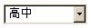
<h:selectOneListbox>、<h:
selectOneMenu>的设定方法类似于<h:
selectOneRadio>,以下分别列出<h:selectOneListbox>、<h:
selectOneMenu>的外观:

- <h:selectManyCheckbox>、<h:selectManyListbox>、<h: selectManyMenu>
这三个标签提供使用者复选项目的功能,一个<h:selectManyCheckbox>例子如下:
<h:selectManyCheckbox layout="pageDirection"
value="#{user.preferColors}">
<f:selectItem itemLabel="红" itemValue="false"/>
<f:selectItem itemLabel="黄" itemValue="false"/>
<f:selectItem itemLabel="蓝" itemValue="false"/>
</h:selectManyCheckbox><p>
value="#{user.preferColors}">
<f:selectItem itemLabel="红" itemValue="false"/>
<f:selectItem itemLabel="黄" itemValue="false"/>
<f:selectItem itemLabel="蓝" itemValue="false"/>
</h:selectManyCheckbox><p>
value所绑定的属性必须是数组或集合(Collection)对象,在这个例子中所使用的是boolean数组,例如:
package onlyfun.caterpillar;
public class UserBean {
private boolean[] preferColors;
public boolean[] getPreferColors() {
return preferColors;
}
public void setPreferColors(boolean[] preferColors) {
this.preferColors = preferColors;
}
......
}
public class UserBean {
private boolean[] preferColors;
public boolean[] getPreferColors() {
return preferColors;
}
public void setPreferColors(boolean[] preferColors) {
this.preferColors = preferColors;
}
......
}
如果是其它类型的对象,必要时必须搭配转换器(Converter)进行字符串与对象之间的转换。
下图是<h:selectManyCheckbox>的外观,这是将layout设定为pageDirection的外观:

<h:selectManyListbox>的设定方法类似,其外观如下:

<h:selectManyMenu>在不同的浏览器中会有不同的外观,在Mozilla Firefox中是这样的:

在Internet Explorer则是这样的:
